
Where is our organic funnel actually leaking?
Short answer
Measure the drop between each step, then compare it against your own best segment instead of an industry benchmark. Your best-converting traffic source already proves what each step can do on your site, with your product and your prices. The step where your worst segment falls furthest behind your best one is the leak worth fixing.
Stop using industry benchmarks
Published benchmarks mix companies with different prices, sales cycles and buyers. Being told the average B2B site converts at 2.3% tells you nothing about whether your comparison pages should convert better than they do.
Your own best segment is a much better yardstick. It already accounts for your product, your prices and the way you sell. If one traffic source gets 6% of visitors to a demo, then 6% is possible on your site, and every segment sitting below it has a specific reason.
Measure every step for every segment
Split your organic traffic into four or five segments. By page type works best for content teams: comparison pages, use case pages, blog posts, free tools, docs.
Then measure the same four steps for each.
| Step | What it measures |
|---|---|
| Visit to engaged | Read past three quarters, or over a minute |
| Engaged to button click | Reached and pressed the next step |
| Click to form completed | Finished what they started |
| Form to qualified | Sales agreed it was worth their time |
Now put them side by side.
| Segment | Engaged | Clicked | Completed | Qualified |
|---|---|---|---|---|
| Comparison pages | 71% | 9.2% | 74% | 61% |
| Use case pages | 66% | 6.1% | 71% | 58% |
| Free tools | 82% | 4.8% | 88% | 22% |
| Blog posts | 63% | 0.9% | 69% | 44% |
Read down each column, not across each row. Your best click rate is 9.2%, so blog posts at 0.9% are ten times behind on that one step. Every other column is roughly in line. That is your leak, and it is specific enough to act on.
Fix the step, not the segment
The table above tells you something narrower than "blog posts convert badly". It tells you blog readers engage almost as well as everyone else and then refuse the next step ten times more often.
That rules out most explanations. The traffic is interested, the form works, and the leads that do come through are reasonably good. What is broken is the thing you ask them to do next.
Notice also what the free tools row is telling you. Everything looks excellent until the last column, where only 22% are qualified. That is a completely different leak in the same table, and it usually means the tool attracts people who will never buy. Which pages produce qualified opportunities rather than just form fills covers that one.
Fix your measurement before you trust the table
Two things quietly corrupt this table, and both are worth ten minutes.
Bot traffic inflates the top. Crawlers and scrapers land on pages, never engage, and drag your first column down for reasons that have nothing to do with your content. Is bot traffic masking a real conversion problem covers filtering them out.
Assistant visits land in the wrong channel. Google's AI Assistant channel in GA4 began on 13 May 2026 and does not backfill. Perplexity has not been on Google's source list, so those sessions arrive as Referral. Google's own AI Overviews and AI Mode clicks are filed under Organic Search. Visits with no referrer fall into Direct. Check Google's channel definitions rather than any published list, because the list changes.
So part of your organic traffic is being counted elsewhere, and it is often the part arriving late in the buying process. Analyze AI separates it in the AI Traffic Analytics view, which reports assistant visits per landing page rather than folding them into one channel.
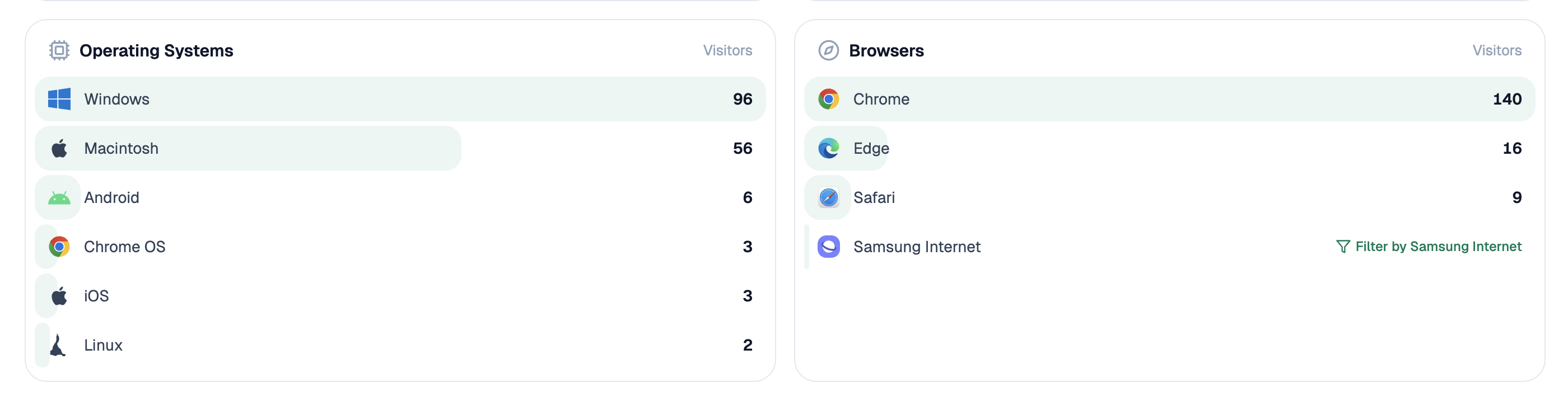 Assistant sessions stay visible per page, so a segment is not judged on numbers that quietly exclude some of its visitors.
Watch the gap rather than the rate
One more habit makes this useful over time. Track the gap between your best segment and your worst at each step, not the raw rates.
Raw rates move for all sorts of reasons. A good month lifts everything and a bad month drops everything, which makes any single number hard to read. The gap between two of your own segments cancels most of that out, because both segments saw the same month.
When the gap narrows, your fix worked. When it widens, something changed in the weaker segment specifically.
Have an agent rebuild the table monthly
Start (schedule, monthly) → GA4 Page Breakdown for visits, engagement and events by page → Prompt LLM sorting pages into segments → HubSpot Search Deals for which leads sales accepted → Code node working out each step per segment and the gap against your best → workflow-memory recipe pulling last month's gaps → Send Notification with only the steps where the gap widened.
Adding workflow-memory is what turns this from a report into a warning system. A table you rebuild monthly gets skimmed. A message saying one step got worse gets read.
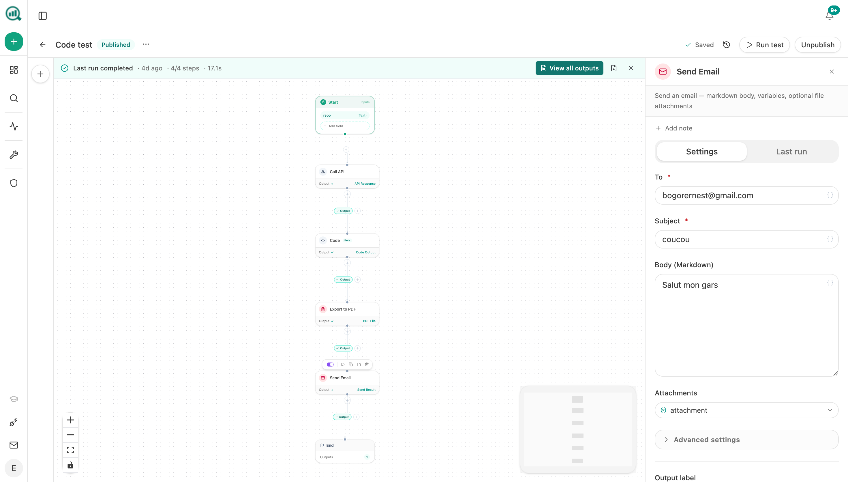 A notification step means you hear about the step that got worse, rather than rereading the same table every month.
FAQ
Related answers
- Why does our organic traffic not produce demos, calls, or sales?
- How do I tell whether low conversion is caused by intent, trust, offer, UX, or pricing?
- Which pages produce qualified opportunities rather than just form fills?
- Is weak trial conversion an acquisition problem or an onboarding problem?
Find the step that is actually leaking
Analyze AI measures every step for every segment, compares them against your own best, and tells you which gap got worse.
Start your free trial