
How do I tell lead volume from lead quality?
Short answer
Plot the share of leads sales accepts against the number of leads, month by month. If the accepted share falls as volume rises, you have a quality problem. If the share holds steady and pipeline is still short, you have a volume problem. One chart settles an argument that otherwise runs for years.
Plot two lines instead of arguing
The argument is always the same. Sales say the leads are bad. Marketing say sales are not working them. Both sides have anecdotes and neither has the chart that would settle it.
Build it once. For each of the last 18 months, plot the number of leads and the share of them sales accepted as worth pursuing.
| What the two lines do | What it means |
|---|---|
| Volume up, accepted share down | Quality. You bought reach, not buyers |
| Volume flat, accepted share down | Quality, and something changed. Check your sources |
| Volume up, accepted share steady | Working. Keep going |
| Volume flat, accepted share steady, pipeline short | Volume. You need more of the same |
| Volume down, accepted share up | You tightened targeting. Check pipeline is still enough |
Use the share sales accepted rather than the share that closed, because closing depends on things marketing does not control. Acceptance is the cleanest read on whether the lead was the right person with the right problem.
Break it down by source before you act
The whole-company chart tells you which conversation to have. The source breakdown tells you what to do.
Split the same two measures by where leads came from: organic search, paid, referral, events, assistant traffic. What usually appears is that quality has not fallen at all in most sources, and one source has grown fast while accepting poorly.
That is a much easier problem than "our leads got worse". It is one channel, and often one campaign.
While you are there, check that the sources are labelled correctly. Google's AI Assistant channel in GA4 started on 13 May 2026 and does not backfill, Perplexity has not been on Google's source list so those visits land in Referral, Google's own AI Overviews and AI Mode clicks go under Organic Search, and visits with no referrer fall into Direct. Read Google's channel definitions rather than trusting a published list. Analyze AI reports assistant visits separately in AI Traffic Analytics, which stops a small high-quality source hiding inside Direct.
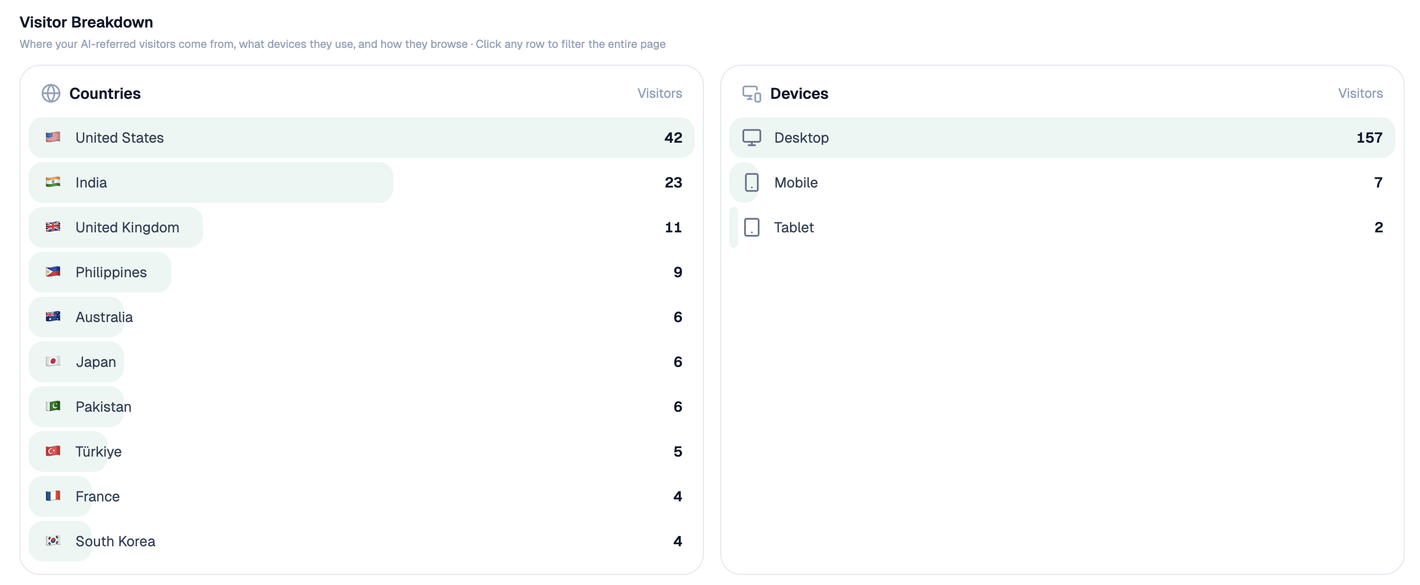 Assistant sessions are reported separately, which stops a small high-quality source hiding inside Direct.
Agree what accepted means before you measure it
This whole method depends on one definition holding still, and it usually does not.
Write down what makes a lead accepted, with a date on it. Then check the definition has not drifted by sampling ten accepted and ten rejected leads each quarter and reading them. Drift is normal and invisible, and it shows up as a quality trend that is really a definition change.
The other trap is that acceptance is a judgement made by people under pressure. A rep with a full pipeline rejects more. If your accepted share drops in a quarter when sales were busy, check headcount and quota attainment before blaming marketing.
Trace quality back to the page
Once you know it is quality, the useful question is which pages are producing the poor leads.
Rank pages by the share of their leads sales accepted, not by how many leads they produced. The list usually inverts. Your biggest lead source is often a free tool or a popular guide with an acceptance rate half your average, while a quiet comparison page produces a handful of leads that sales take every time.
Which pages produce qualified opportunities rather than just form fills covers that ranking properly. And if the poor leads trace back to the topics you write about rather than the pages themselves, how do I find topics that attract buyers instead of students and researchers is the deeper fix.
Watch for the third answer
Sometimes both lines look fine and pipeline is still short, which means the problem is neither volume nor quality.
Three things produce that. Leads are fine and slow follow-up is killing them, covered in are we buying more leads when the real problem is slow follow-up. Deal sizes shrank, so the same pipeline count is worth less. Or your sales cycle lengthened and the pipeline is still forming.
Check deal size and cycle length alongside the two lines. It costs one extra column and it stops a healthy funnel being rebuilt for no reason.
Build the chart as a standing report
Start (schedule, monthly) → HubSpot Search Contacts for leads created by month with their source and first page → HubSpot Search Deals for which were accepted and which became opportunities → Code node working out volume and accepted share per month and per source → workflow-memory recipe holding the previous 18 months → Export Excel with both lines → Send Notification if the accepted share moved more than five points.
Alerting on a five-point move rather than sending the chart every month is what keeps anyone reading it. A monthly chart becomes wallpaper within a quarter.
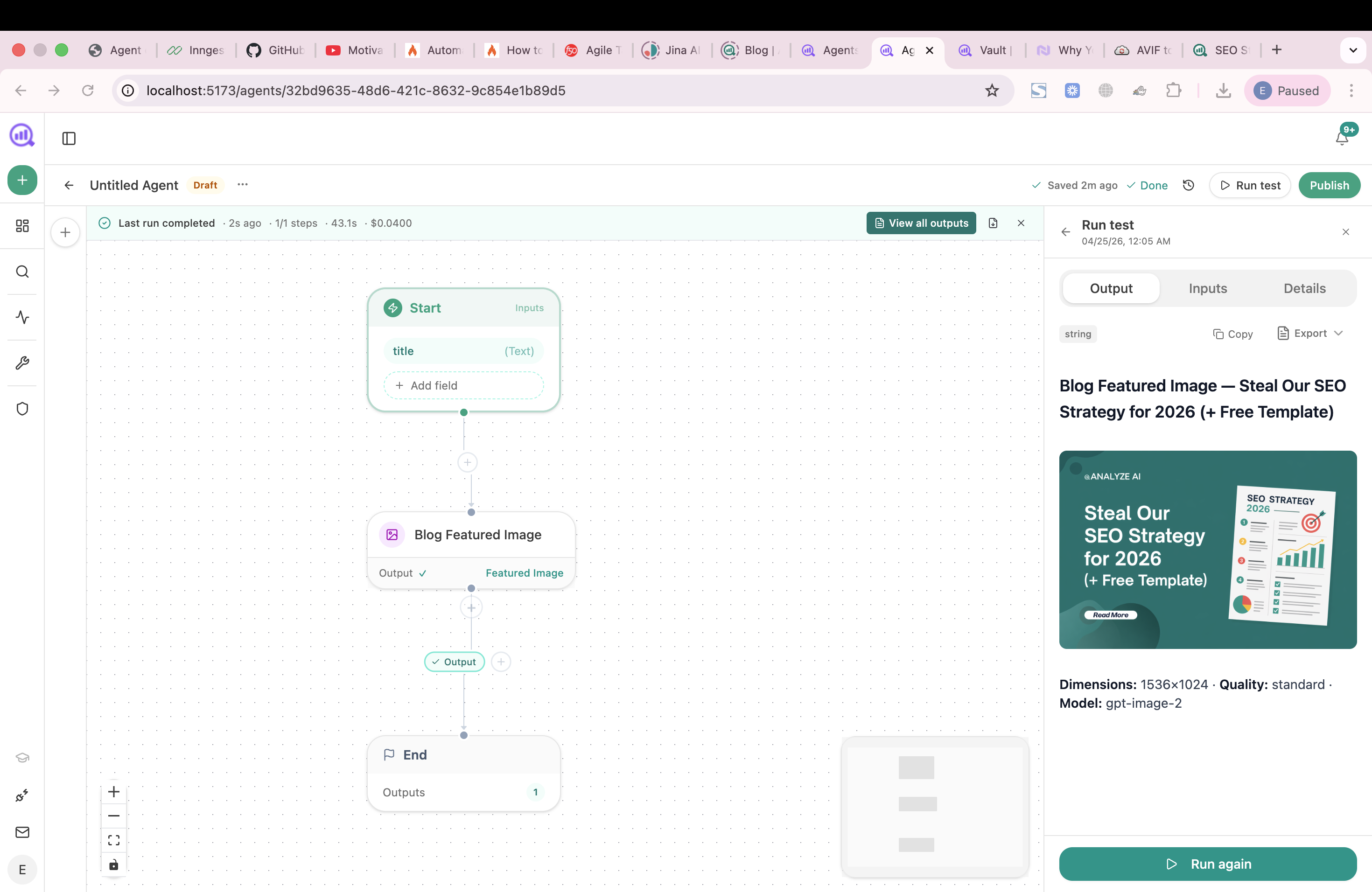 The monthly chart is a workflow here, pulling the CRM nodes into a Code step and alerting only when the line moves.
FAQ
Related answers
- Why do our MQLs never become pipeline?
- Which pages produce qualified opportunities rather than just form fills?
- Are we buying more leads when the real problem is slow follow-up?
- Does our offer match the audience our SEO attracts?
Settle the volume-versus-quality argument
Analyze AI tracks accepted share against volume by month and by source, and tells you when the line actually moves.
Start your free trial